FromWord
Lake45
Make the beauty and elegance of sailing on Lake Como a distinctive brand, and bring these values to life through a dedicated website.
Client:
Lake45
Year:
2025
Service:
Brand Identity & Web Design
Timeline:
2 months
Logo design
Lake45 is the result of a design approach that blends storytelling, coordinates, and territory. The name immediately evokes Lake Como, while “45°” refers to the latitude of Tremezzo, the birthplace of the service. Every element plays a narrative role: from the graphically expressed degree symbol to the descriptive payoff that clarifies the activity. A clear identity, rooted in context, designed to convey belonging and orientation.

Naming and identity with geographical roots


Brand lives in the details
An embroidered cushion. A carefully arranged corner for relaxation. A moment on board designed for those who want to experience the lake in style. Even the simplest details become extensions of the brand, transforming the experience into identity. Because true luxury is not about ostentation, it’s about consistency, feeling, and atmosphere that the brand manages to create.

Where the brand takes shape
Every detail, from the business card to the brochure, is crafted to express the brand’s identity with consistency and precision. Elegant typography, refined materials, deliberate color choices. Each medium becomes a visual and tactile extension of the lake experience. The brand identity is thus translated into real, memorable, and recognisable objects.


Latest projects
View Project
Two in the Loop
Brand Identity & Web design
2026
View Project
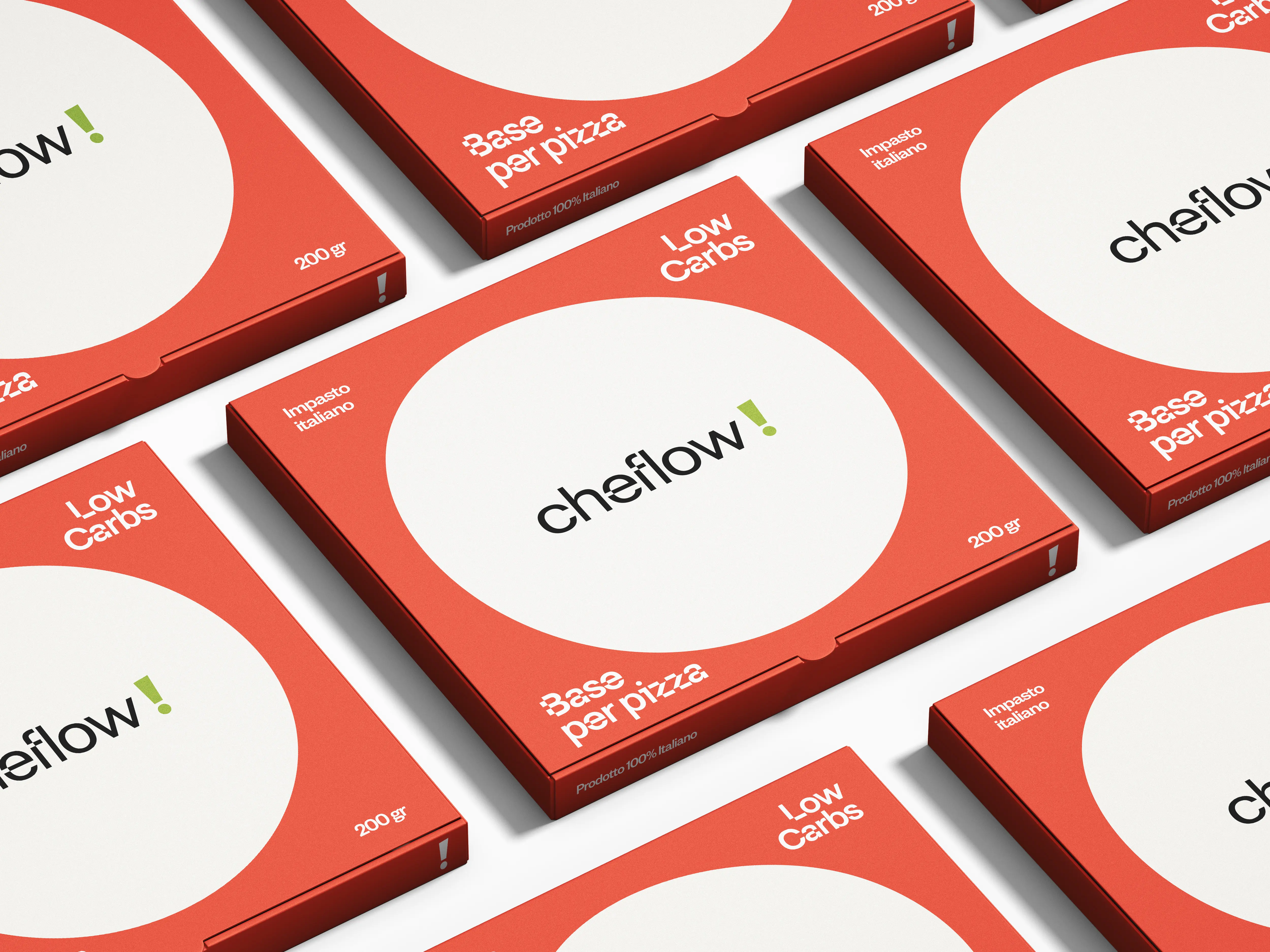
Cheflow!
Brand Identity & Packaging
2026
View Project
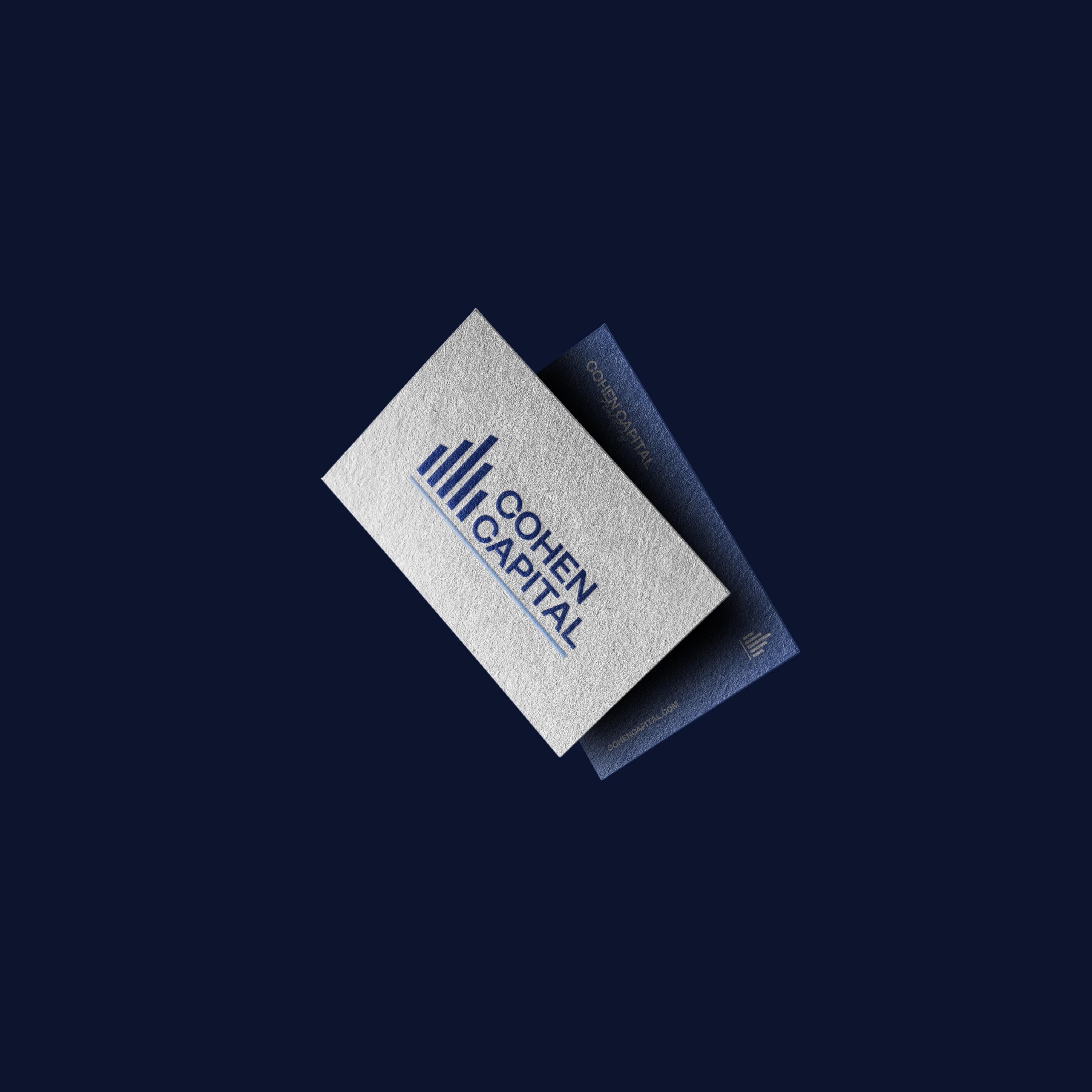
Cohen Capital Holding
Brand Identity & Web design


