about
The concept preserves the authenticity of Italian pizza while shifting its perception toward a fresher, more contemporary and moody brand environment. Here, seriousness is not equated with quality, and beauty is understood as pleasure. The brand expresses high quality through a renewed aesthetic language, presenting the product as something new rooted in excellence, not in overused or nostalgic visual codes.
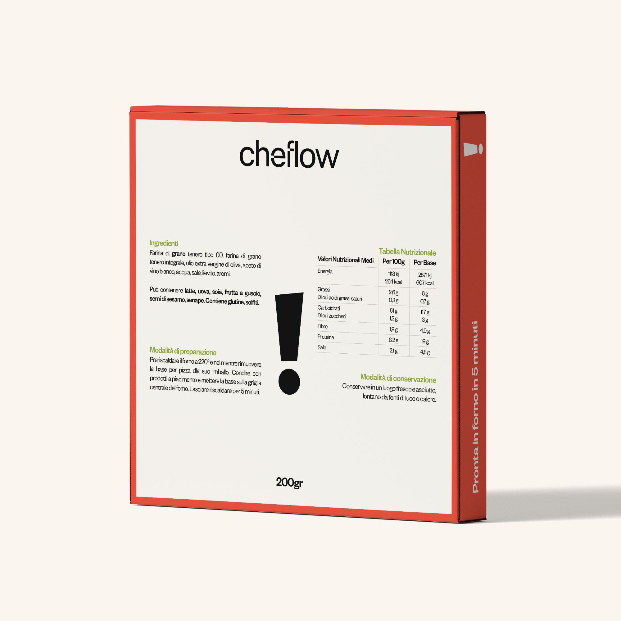
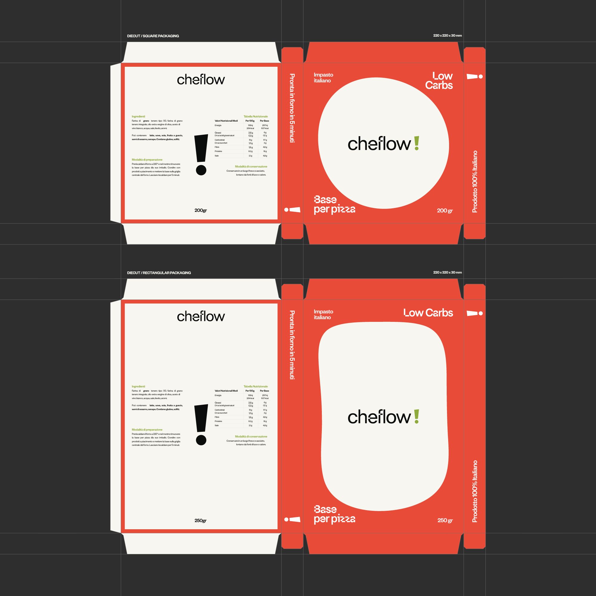
The product remains central, but packaging plays a key role in making its value visible. The structure of the packaging is designed to convey the sense of wellness the product represents, bringing quality outside the product itself. It acts as a “vest”: something that sparks curiosity at first glance while clearly communicating the product’s level of quality and care.
What brings people closer to a brand is not the logo alone, but the ecosystem built around it. People want to recognize themselves in the values, tone and messages a brand expresses. Pizza is deeply rooted in Italian culture, yet it should not be confined to a traditional or outdated representation. Keflow! embraces this idea by reinterpreting one of the world’s oldest products through new types of dough and a contemporary brand language.
Explore


other works