about
The logo is built around two central elements: the cross and drops. The cross, a universal symbol of health, represents the essence of pharmaceutical service, giving confidence and trust to people. The drops are a visual reminder of the lake, to echo the context, name and represent serenity and purity.
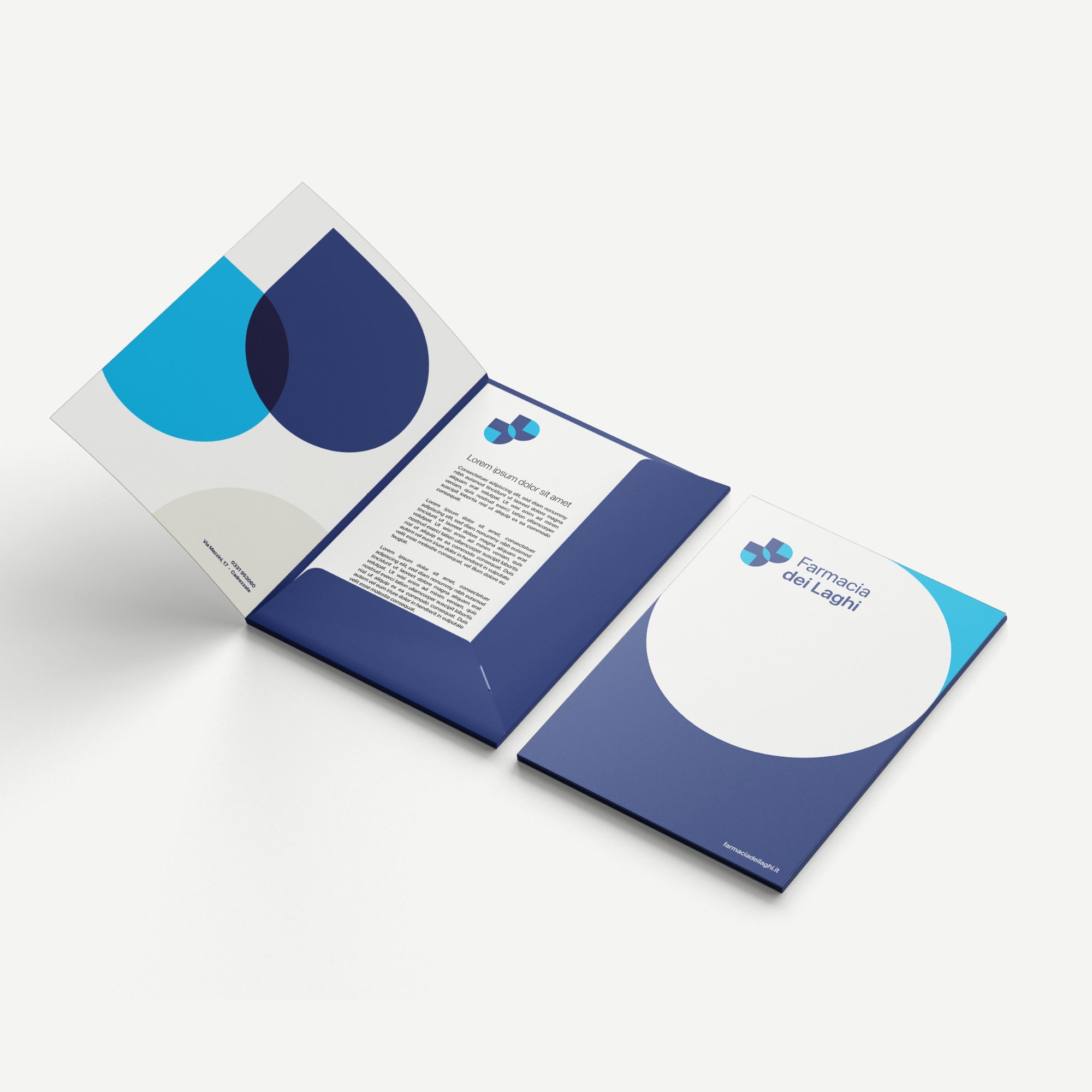
It is crucial to apply the brand in the whole ecosystem created by the business, this can be done thanks to adaptation of messages and branding traits on different support asset, both digital and physical.
In order to achieve the goal of creating a wellness hub, we decided to create a company identity around the logo, which is able to adapt to the different disciplines offered by Farmacia dei Laghi.
Create a seamless experience that immerses people in the world of Farmacia Dei Laghi. This can be done leveraging branding across various touch points to create a genuine sense of belonging and connection.
Explore




other works