about
From the idea of merging the image of the ape with a gym tool, the concept of using a kettlebell as the primary form to represent the animal’s typical facial expression was born. This also refers to the power and explosiveness inherent in the gorilla itself and in those who train through The Ape Shape.
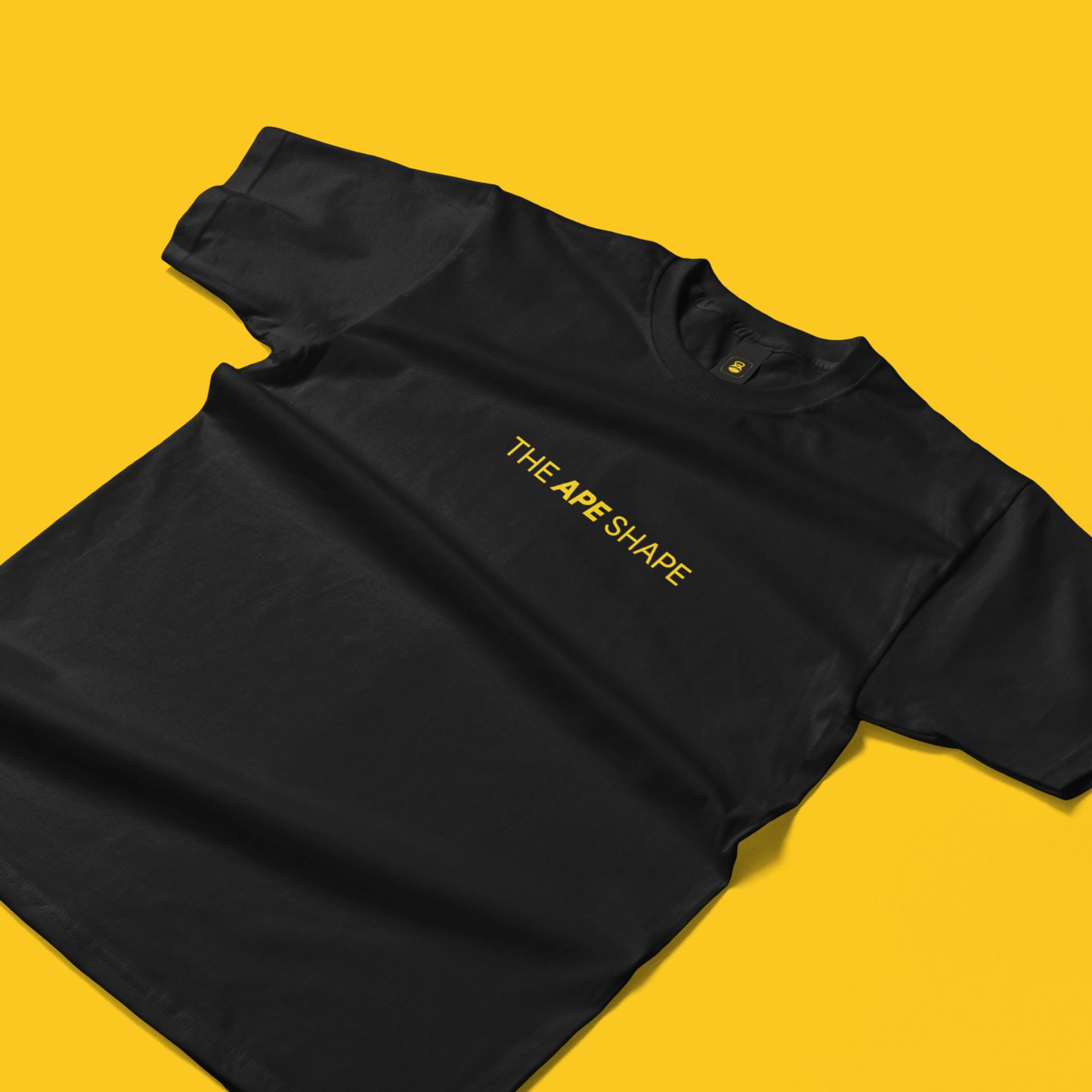
Translate the brand elements and values into the physical world by applying them to practical, tangible items that showcase the brand’s essence and purpose.
The chosen typeface reflects the brand’s intended feel: it is clean and straightforward at first glance, but can become bold and dynamic when needed, mirroring the brand’s powerful and assertive nature.
The selected colors boldly emphasise the brand’s desire to stand out, with vibrant and prominent hues that underline key activities and ensure high visibility.
Explore




other works